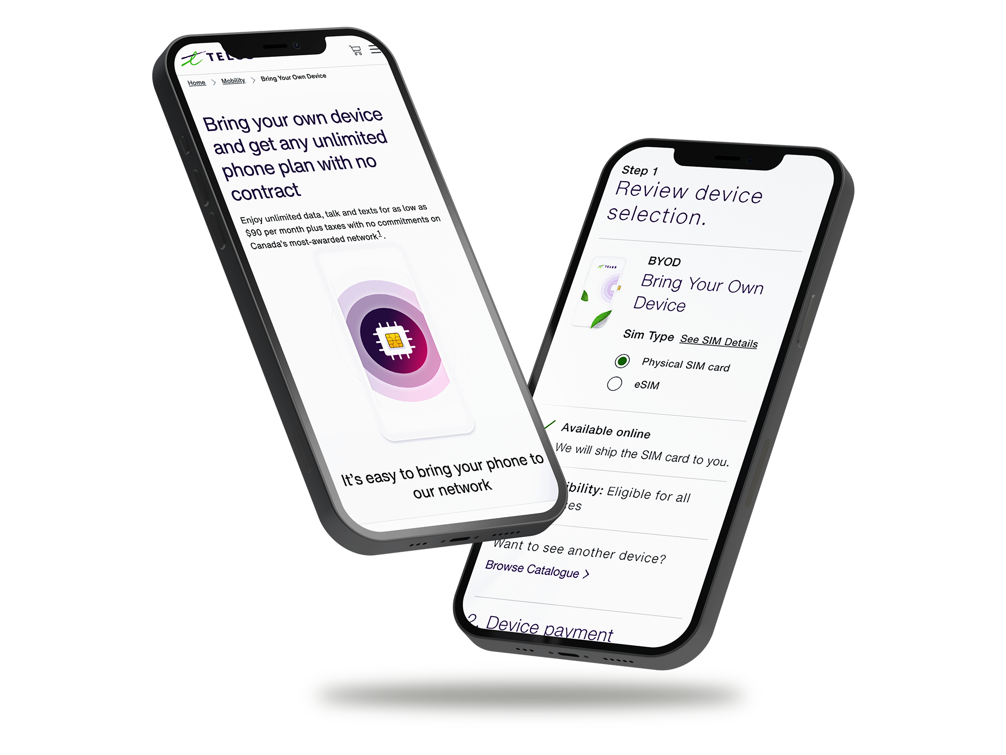
I simplified the TELUS plans experience to reduce friction and create a faster, more intuitive BYOD purchase journey.
The opportunity
Make plan selection simpler, clearer, and easier to trust.
The existing journey made BYOD customers work too hard to compare plans. Pricing changed across screens, guidance was limited, and too many steps stood between customers and a decision. I reframed the challenge around helping people understand their options, trust the price, and know what to expect next.
Customer outcome
Choose a plan with confidence, without unnecessary effort.
Business outcome
Grow plan selection and BYOD conversion while supporting revenue.
Design focus
Clear plan details, guided steps, consistent pricing.
Reported results
2024
Business impact from a clearer plans journey
7.7%
Increase in plan rate selection
768
Incremental RGUs supported in 2024
209k
Incremental revenue growth for 2024
The problem
Customers needed a clearer way to compare and choose plans.
For BYOD customers in particular, choosing a plan involved too much effort. Funnel analytics and customer feedback pointed to a few recurring issues:
·Customers moved through too many steps before they felt ready to choose.
·Pricing was not consistent across the journey.
·The page offered too little guidance, and the visual hierarchy made comparisons harder.
·The resulting confusion and frustration contributed to drop-off.
The friction went beyond usability: inconsistent pricing and unclear guidance made it harder to trust the decision.
The journey involved 7+ steps to configure a plan and 19+ steps end to end in BYOD. Pricing discrepancies and unclear next steps added to the effort.
Objectives in focus
I set goals that connected a better customer experience to stronger funnel performance.
Customer goals
·Reduce the steps needed to select and purchase a plan.
·Present pricing clearly and consistently throughout the journey.
·Help customers feel confident they are choosing the right plan for their needs.
Business goals
·Increase plan selection and BYOD conversion.
·Improve customer trust and satisfaction.
·Measure success through funnel performance and revenue impact.
That gave the work a clear direction: improve the quality and confidence of the decision, not just the arrangement of the page.
Competitive analysis and research
The strongest experiences made the choice clear, not complicated.
I reviewed telecom, fintech, and subscription experiences to see how they helped customers make decisions with less effort.
Patterns I found
·The best plan cards helped people compare, rather than simply promote an offer.
·A guided, step-by-step flow felt easier to follow than presenting every choice at once.
·Pricing needs to stay consistent wherever customers encounter it.
What users needed
·People wanted fewer, clearer choices, not more filters.
·Clear pricing mattered more than promotional detail.
·Long configuration flows made people less confident, even when the price was competitive.
I tested these themes with 36 BYOD-focused participants, including TELUS and non-TELUS customers across a range of ages and income levels. They wanted to make a confident choice early, rather than adjust it later.
Research insights informed the hierarchy, amount of choice, and progression through the flow.Click to enlarge
I carried three principles into the design: make plan details clear, guide customers one step at a time, and keep pricing consistent.
Wireframes and journey
I structured the experience around the decisions customers needed to make.
In wireframes, I brought the most important plan details forward, simplified the cards, and made the next step easier to understand. I limited the number of choices shown at once to help reduce decision fatigue.
·Bring key plan details forward for easier comparison.
·Design plan cards to support comparison.
·Guide customers through a clear sequence of decisions.
I used prototypes to test clarity, pricing, and progression.
I built interactive Figma prototypes to test plan-card clarity, pricing comprehension, and the flow of decisions, while giving partners something concrete to respond to. I led multiple rounds of remote testing over Google Meet with TELUS and non-TELUS customers across different ages, incomes, and industries.
Pain points tested
·Where pricing breakdowns caused confusion.
·Where customers were unsure what to do next.
·How much effort customers expected BYOD to take.
What users told us
·Customers described the simplified flow as lighter and more intuitive.
·Clearer pricing reduced confusion.
·Fewer steps made the experience feel more efficient and satisfying.
·A clearer hierarchy made the plans easier to scan.
·Refined copy gave customers more guidance and reassurance.
Testing feedback informed final refinements to hierarchy, pricing clarity, and guidance.Tap through the live prototype
Open the prototype in Figma
Final experience and handoff
A plan-selection experience designed to stay clear through checkout.
The final page uses plan cards to make comparisons easier, keeps pricing consistent from selection through checkout, and removes unnecessary steps while preserving flexibility. TELUS Design System components support consistency and future updates.
The final plans page at desktop width.Click to enlarge
The redesigned Plans page is live and supports TELUS’s BYOD strategy.
Design documentation
In Figma, I documented layout and component changes, spacing, interactions, tab order, and accessibility requirements so the team could implement the experience consistently.
Content governance
I partnered with the content team to create a governance framework that aligned Marketing and Development around one source of truth.
Phase one design specifications, documented in Figma.Click to enlarge
Removing unnecessary steps and clarifying pricing early helped customers move forward with more confidence. The project reinforced how much clarity, trust, and speed matter in a high-stakes journey tied to business results.
Key learnings
·A few well-explained choices can work better than a complex configurator.
·Clear pricing helps build trust.
·When customers feel confident, they are better positioned to complete their purchase.
Current status
The redesigned Plans page is live and supports TELUS’s BYOD strategy. In 2024, the work contributed to gains in plan selection, RGUs, and revenue.
I led the experience from discovery through delivery.
As Lead Designer, I partnered with Marketing to define business requirements and promotional constraints, led user research, and developed wireframes, high-fidelity designs, and interactive prototypes. I shaped the visual hierarchy and interactions using the TELUS Design System, and facilitated workshops to align Product, Marketing, Engineering, and Analytics.
Project details
Role
Lead Designer, end-to-end experience
Collaborators
Marketing, Product, Engineering, Analytics
Tools
Figma, Miro, Google Meet, Google Docs
Design system
TELUS Universal Design System
Status
Live and supporting the TELUS BYOD strategy
Click the image to zoom · ← → to browse · Esc to close