
This is a project I worked on to implement my UI/UX skills, which I learnt during my UX Design course at CareerFoundry. The course has brought me a lot of insights and learnings.

// About the Project
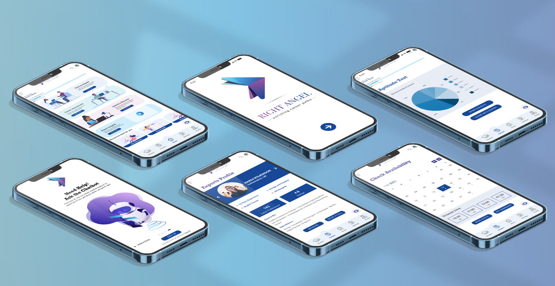
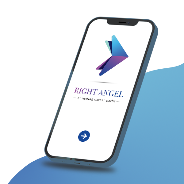
The requirement of the project was to enable anyone, anywhere to instantly chat with an expert in virtually any field. The goal of this app is to give people a simple, intuitive way to connect with an expert in nearly any field within seconds so they can feel more informed and more prepared to face their everyday problems. Being an immigrant myself I wanted to design an app that provides solution to both students and job seekers to find the correct expert guidance.This was the inception of Right Angel ('Right' as in correct and 'Angel' used as a metaphor for the experts). The process below shows how the project came to life.
My Role:
// UX Designer // User Research // Ideation // Wire-framing // Prototyping // User Testing // UI Design
Tools Used
// Balsamiq // Adobe XD // Optimal Workshop // Google Forms // Indesign // Photoshop // Illustrator // Usability Hub
Project Timeline : September 2020 - April 2021

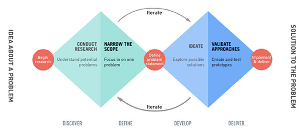
// The Design Thinking Process

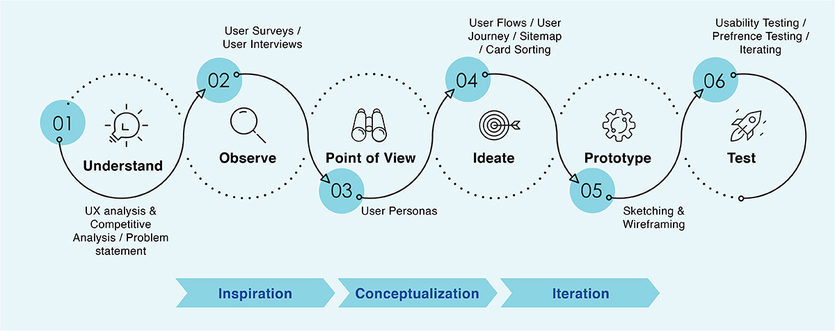
The above framework of design thinking process was followed to develop Right Angel, this framework guided and helped me understand the main needs of the users which helped me in creating a high-quality product. The various steps of the framework are listed below:

// Understand

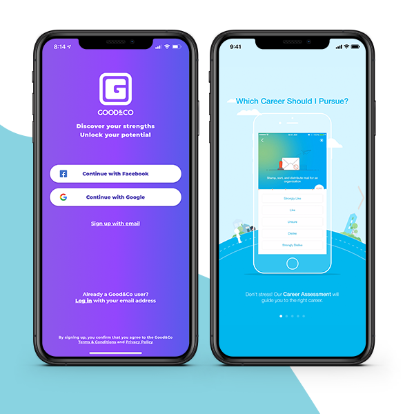
// UX Competitive Analysis
The next step was conducting a UX competitive analysis, which gave me insights into the market of career counselling apps and its market standards. I looked closer at two competitors (Good & Co and Path Source), and found inspiration and opportunities for my project.
Few of the gaps that I thought could be addressed were as below:
// Designing an app that help an individual analyze their skills helping them to choose the right career path
// An app that helps new grads or people seeking career guidance the right direction
To do complete research about the project I went through various steps and processes before I started implementing the project and that helped me understand the main needs of my users and create a high-quality product. The most important step was to conduct UX competitive analysis and user research. The analysis gave me insights into the market of career counselling apps and its market standards.
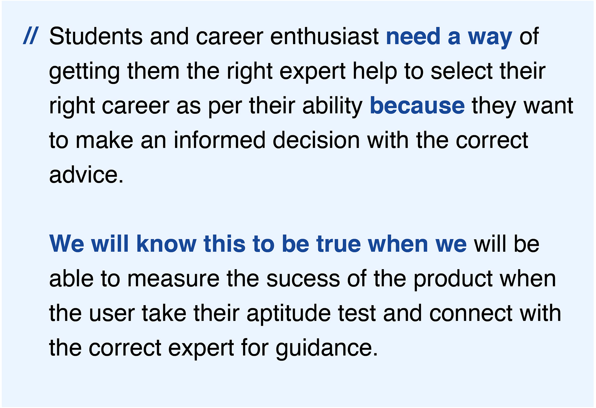
I used the Double Diamond Strategy to define possible problems and possible solutions to develop the initial Problem Statement.
// Problem Statement
I understood the importance that being able to execute high quality design is an essential skill to have, but the most important thing required is the ability to define the possible problems that I’m trying to solve thoroughly and effectively. So I started the process of understanding and defining the problem that I could solve with 'Right Angel'.

// OBSERVE

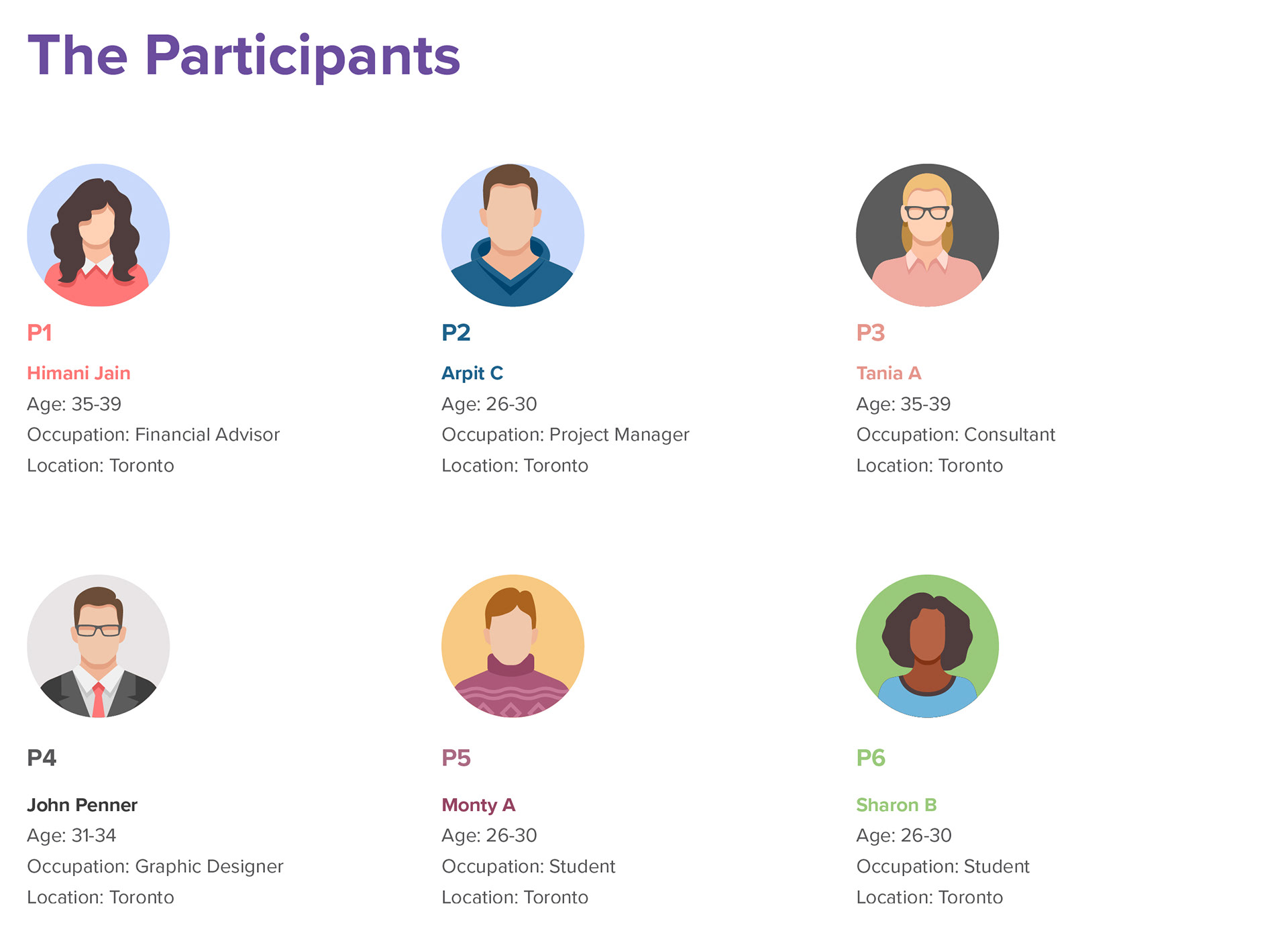
// USER SURVEYS & INTERVIEWS
I conducted survey using Google forms with the potential users and conducted telephone interviews with 12 participants
The average interview time was for 45-50 min plus last 10 min for Question from the interviewees, as most of the questions were open ended interviewees were descriptive and expressive while answering the question.
The research goals for conducting the survey and Interviews were the as follows:
// Research Goal #1 - Identifying needs and motivation when users are looking for expert career guidance
// Research Goal #2 - To see if the users will be considering to get advice via an app
// Research Goal #3 - To determine what features the users are looking for in an app which meet their requirements and needs
// Research Goal #4 - To determine what features stops the users from using the app. Also, to determine the features that disconnect the user from the app
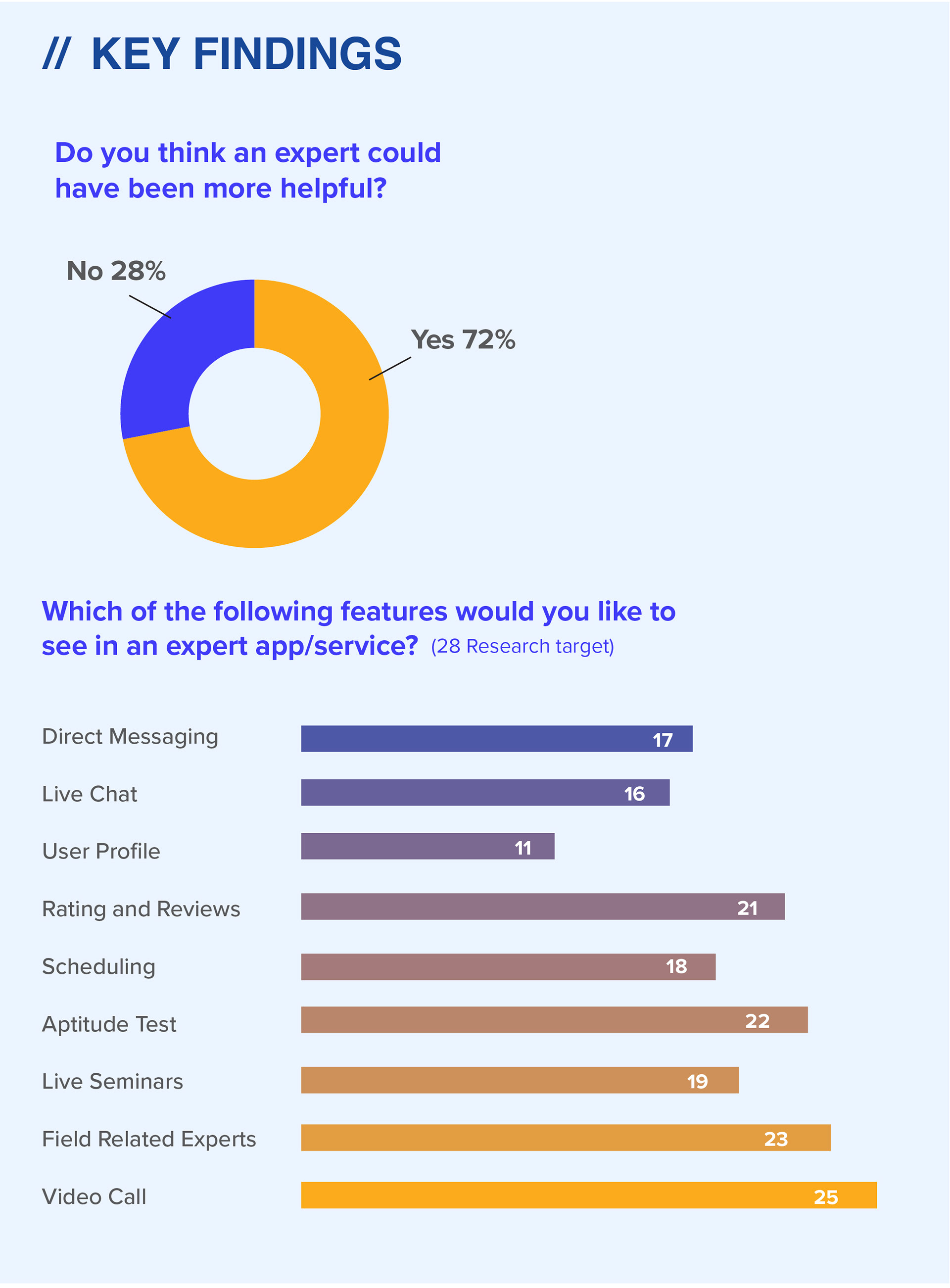
// KEY FINDINGS
/ User found it difficult to find the correct expert for career guidance
/ The users didn’t have any reservations in contacting the expert to seek advice
/ The users wanted more advance options to connect with an expert
/ The user wanted an expert from their field of interest as
/ The users want an app that can evaluate their skills through an aptitude test to give them a better insight of their skills
/ The students would prefer a unbiased opinion about the college making their selection process more relevant

// POINT OF VIEW

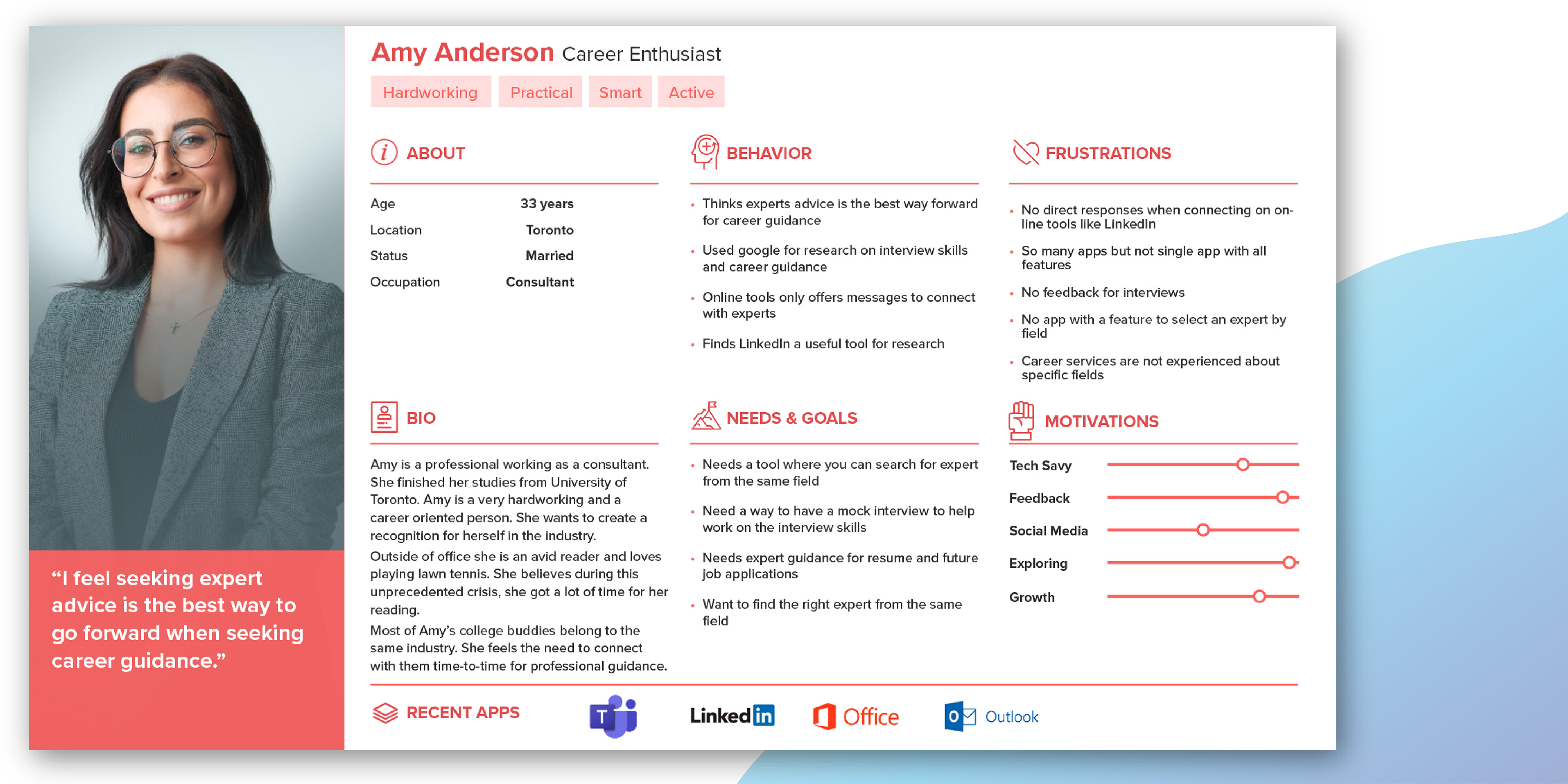
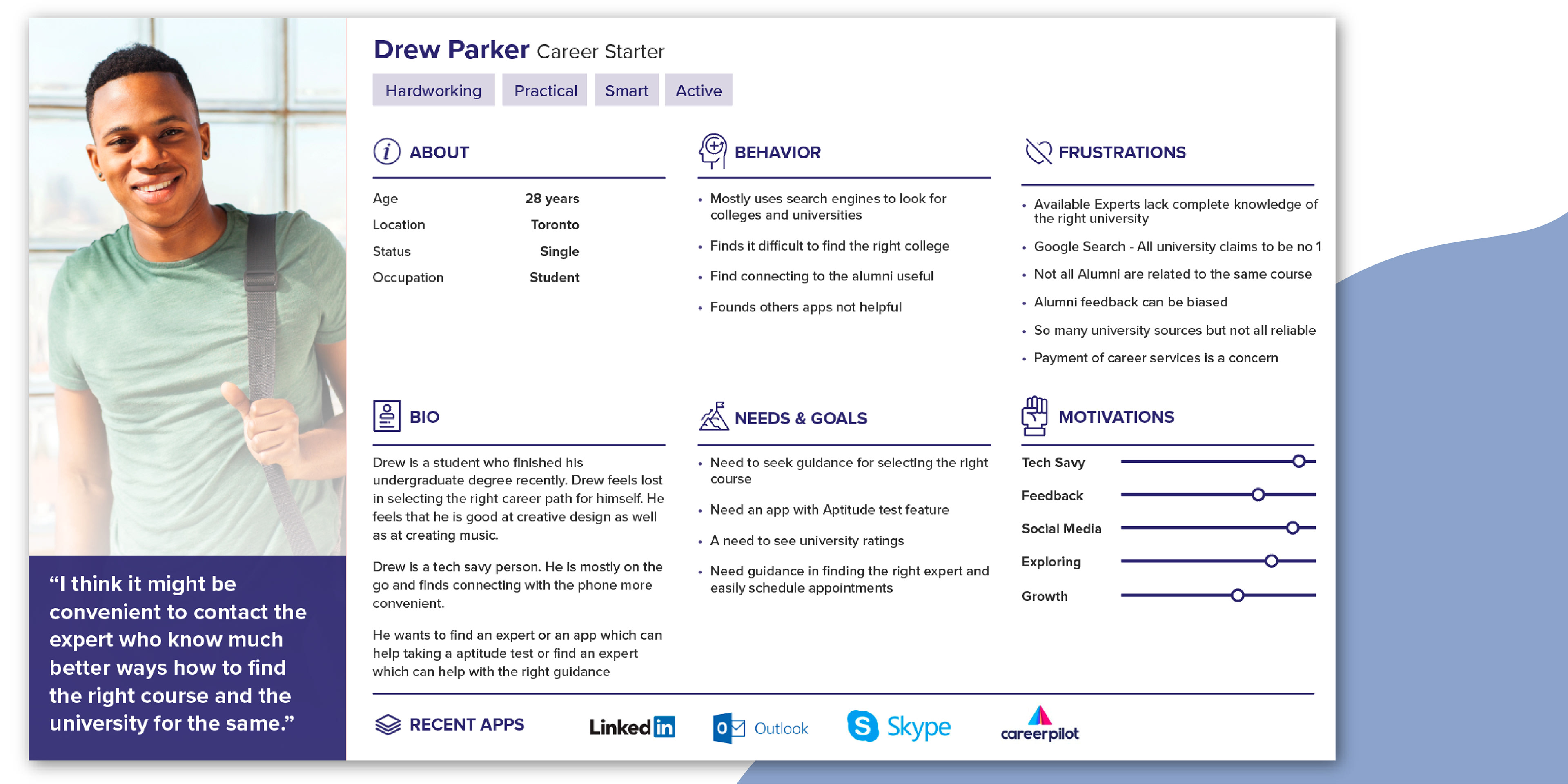
// USER PERSONAS
Crafting the user personas would help the product team find the answer to one of their most important questions, “Who are we designing for?” By understanding the expectations, concerns, and motivations of target users, I created the user personas Amy and Drew which will help me make informed decisions during the whole process of designing the product.

// DEFINE & IDEATE

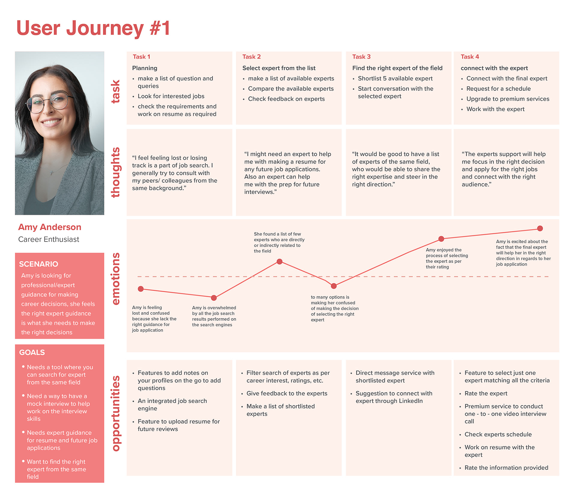
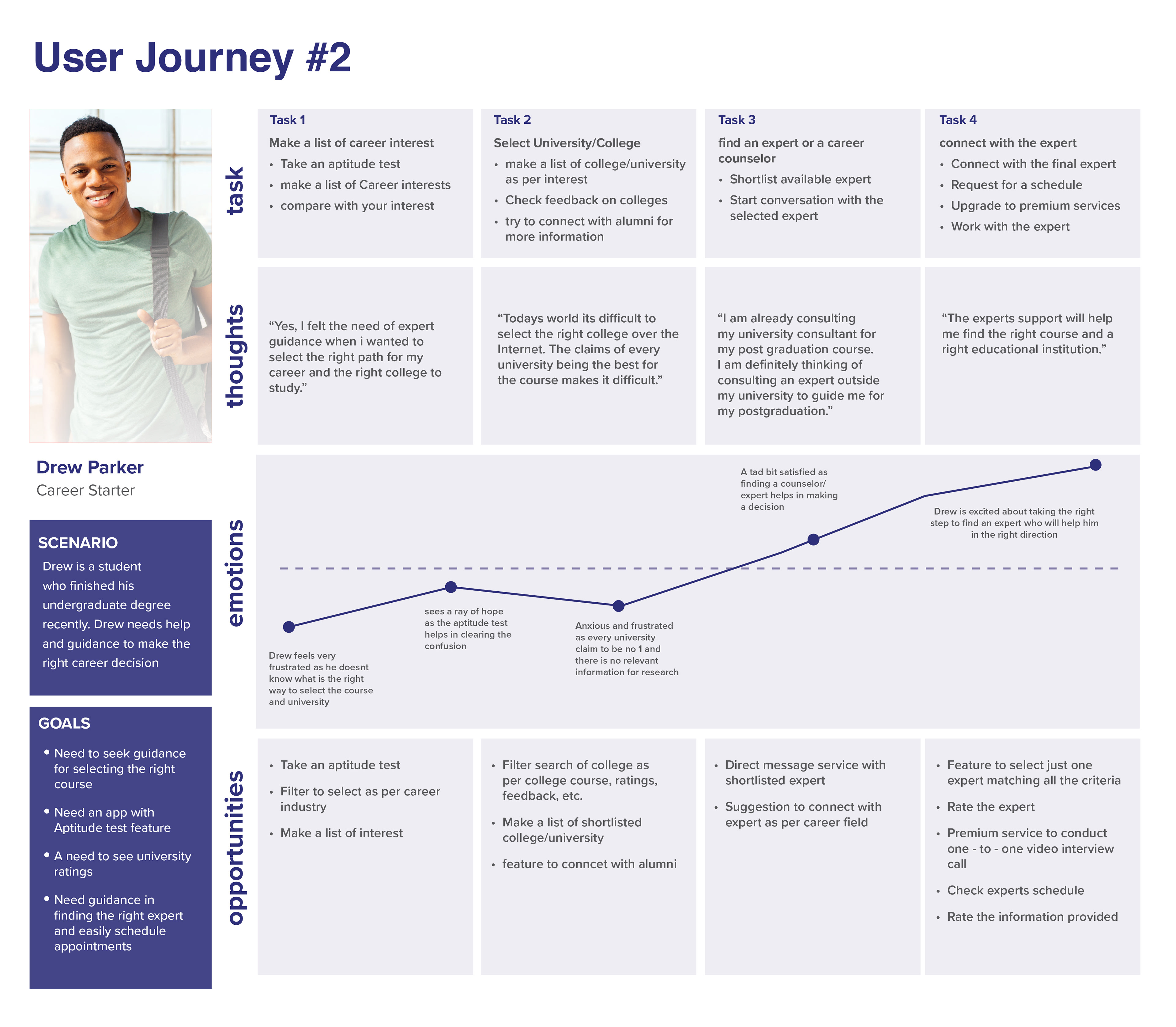
// USER JOURNEY
Turning first-time users into long-term customers requires an understanding of where your users are coming from and what they want to do? To define that I came up with hypothetical scenarios to create the user journey mapping that later helped in keeping the user motivation at the front to further create the UX flows that get users where they want to go.
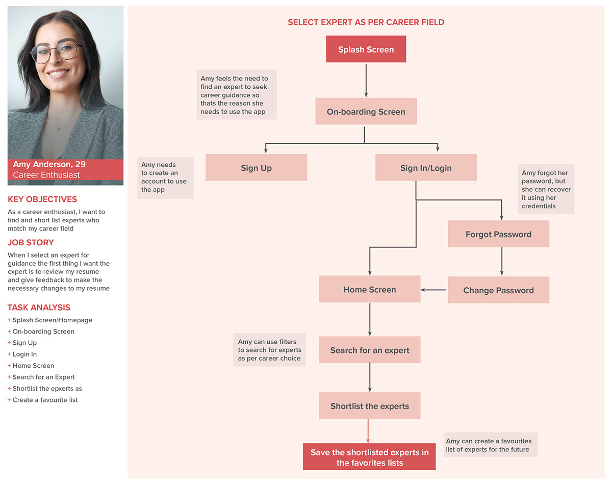
// USER FLOW
Following the creation my personas, I wanted to the visualize what a user's typical experience with 'Right Angel' would feel like. In order to do so, I created 3 different user flows to help me determine what 'Right Angel' would have to look like in order to be the best product for both Amy and Drew.


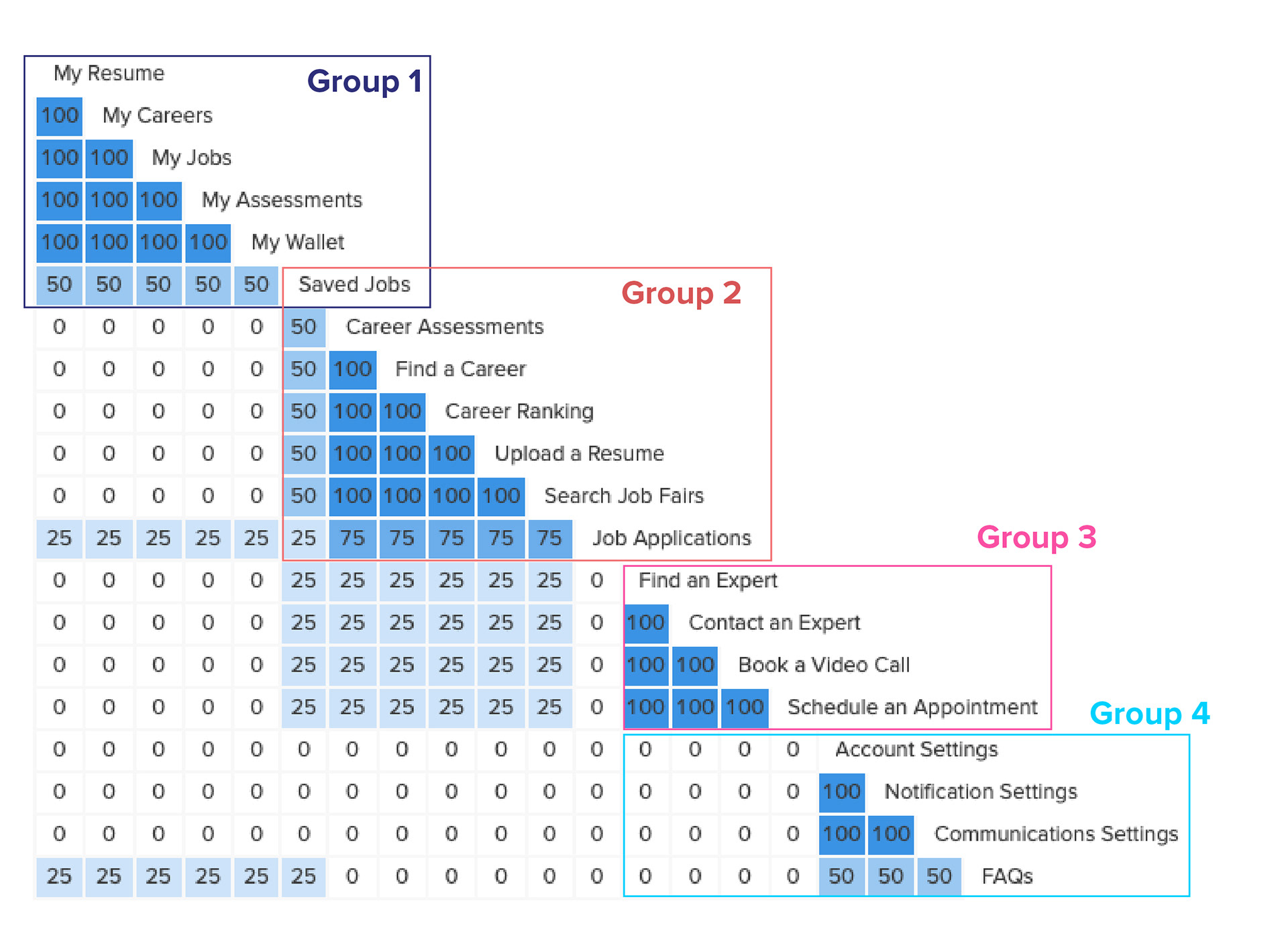
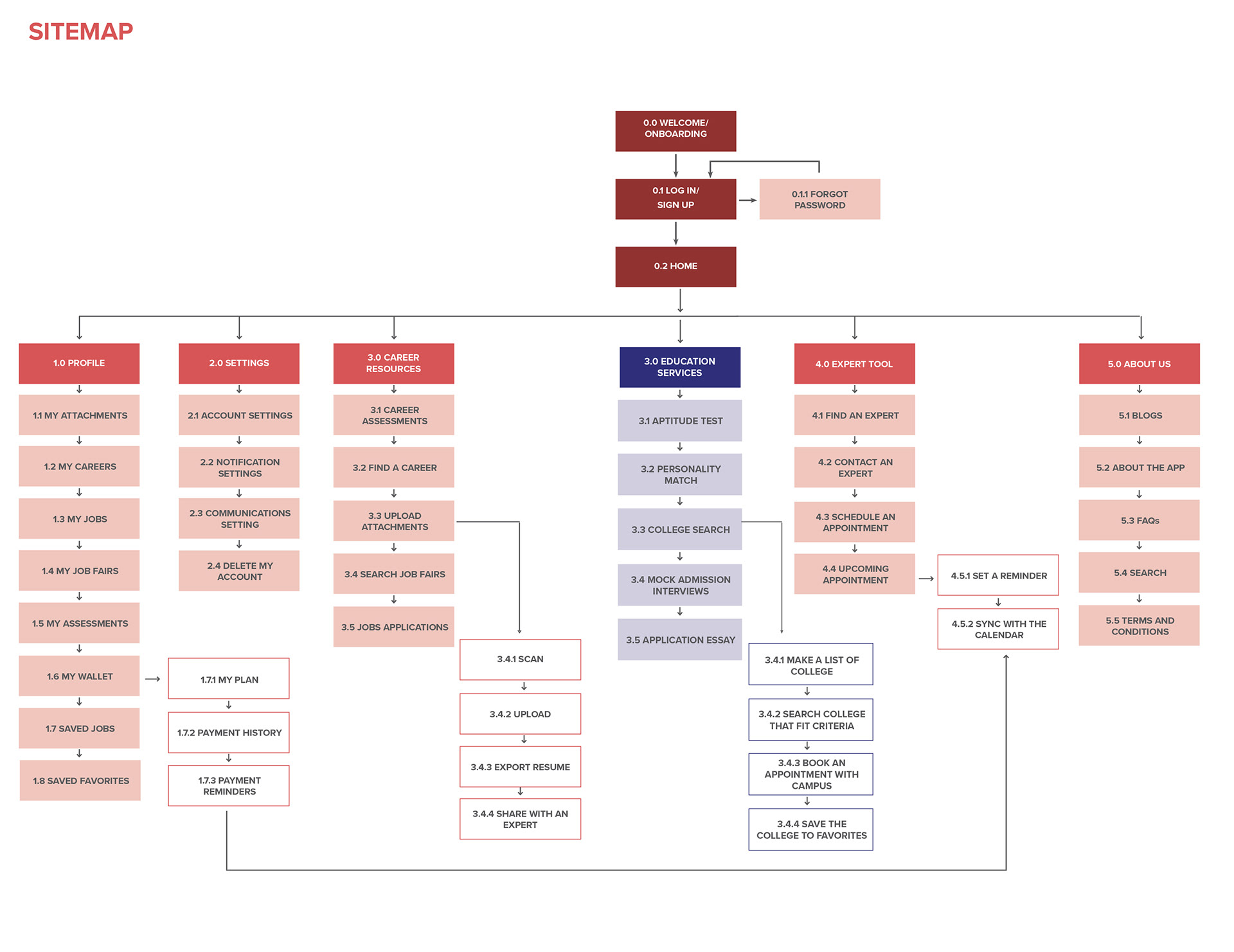
// SITEMAPS
Creating the sitemap helped me to narrow down to the essential pages that 'Right Angel' would feature. The final design below is a revision to the original sitemap following the card sorting. After card sorting, I discovered that the lot of different pages had a much similar grouping strategy as that of my own. Some cards had repetitive functionality and were merged with other groups to create an updated sitemap which made the navigation more simpler. After mapping out the sitemaps, I was able to move forward to creating the wireframes.

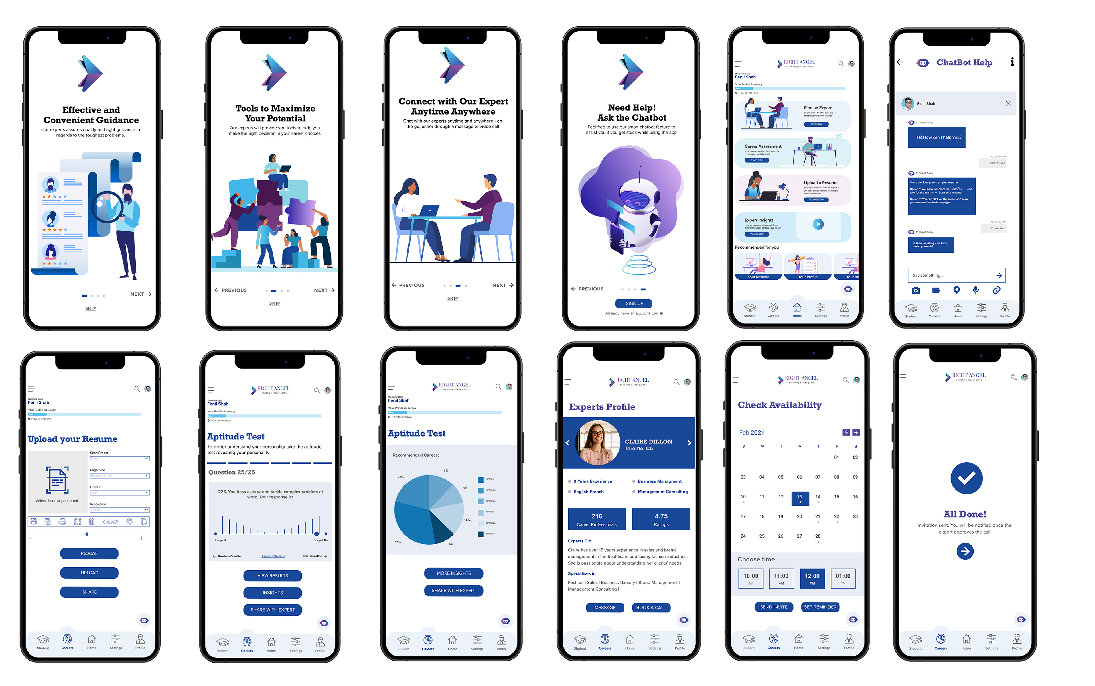
// PROTOTYPE

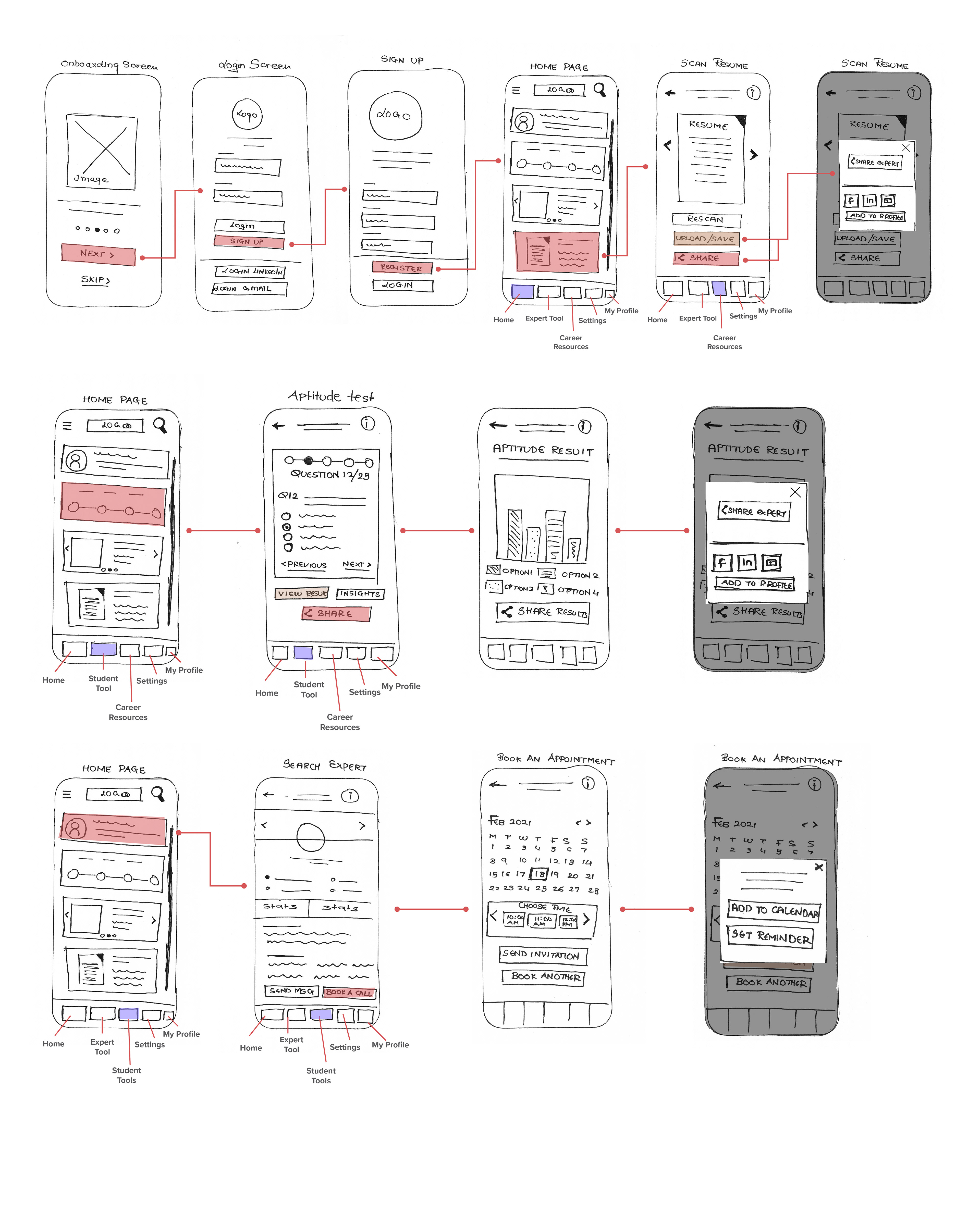
// LOW FIDELITY PROTOTYPE
After creating the sitemaps I started sketching the ideas and focused on creating first sketches of the wireframes for the most important features (Onboarding, Home Screen, Uploading the Resume, Aptitude Test and Selecting the expert). The wireframes helped in defining the internal structure of each page and the link between it key features.
// MID FIDELITY PROTOTYPE
// DESIGN LIBRARY


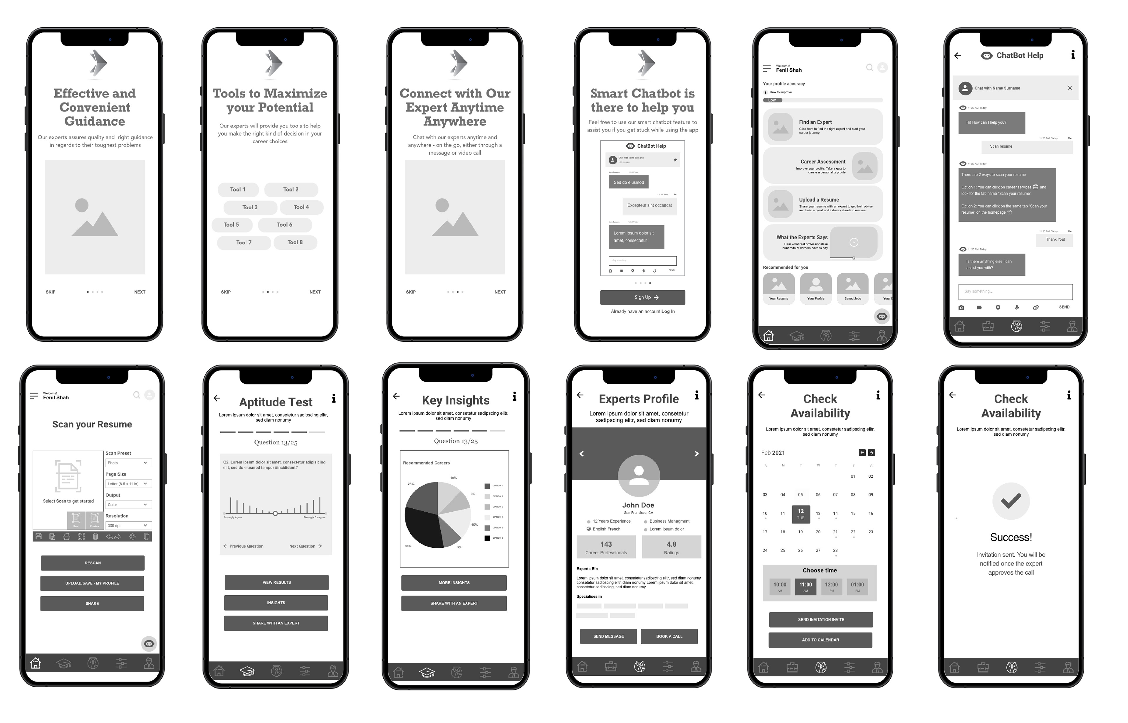
// HIGH FIDELITY PROTOTYPE

// TEST

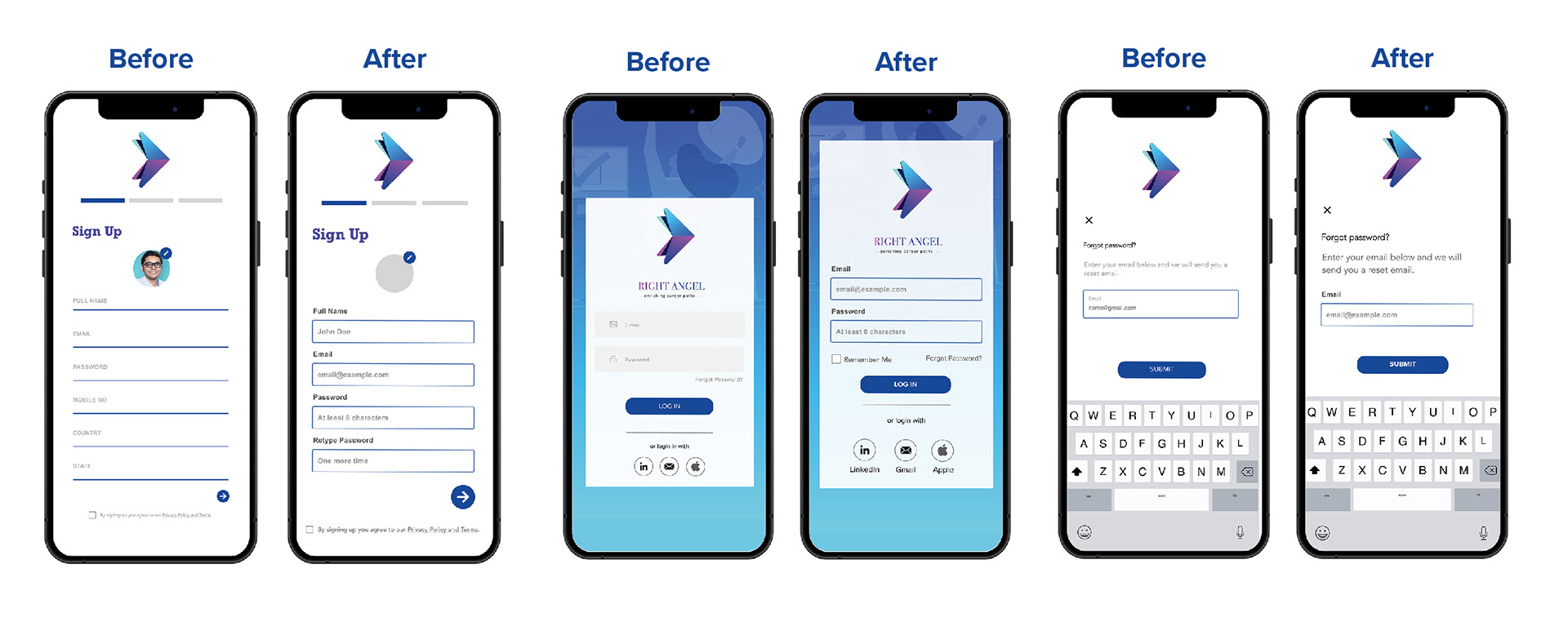
// USABILITY TESTING
To evaluate my design decisions I conducted moderated remote usability tests with 6 participants who performed 5 tasks using my prototype. I used Zoom and Skype to conduct moderated remote usability.
// TEST OBJECTIVES
- To verify if the user can accomplish basic tasks and find the information they are looking for: experts, aptitude test, appointment with the expert.
- To determine if the content presented in a way that is easy to find and understand? Can the user complete a task successfully?
- Assess whether users feel that the app is inclusive and that the layout of features will be useful in making their journey as a customer easier.
After the test sessions I sorted through the finding using affinity mapping. Then I put together a rainbow spreadsheet with my observations, errors and quotes and rated their severity with a usability error scale.

// iTERATIONS
Using the usability error scale allowed me to evaluate the high priority or severe issues to make the recommended changes. Further more I refined the design for better accessibility and made changes based on the peer feedback as well.

// FINAL PROTOTYPE


// WHAT NEXT
There is always an opportunity to improve and evolve the product. As mentioned in the case study, I only designed the main core features of 'Right Angel' because of the limited time frame. There are other few features that can be designed further.
For Instance: Creating the app from the third personas point of view i.e. The Experts
// KEY LEARNING AND TAKEAWAY
This being the first complete UX project it tough to describe how much I learned during the design process of 'Right Angel.' One of the most important lessons I learned was about the nature of the feedback and defending design decisions.
The project was able to give a great insight and knowledge about UX and UI principles, design principles, UX research, new design and prototyping tools, and accessibility and inclusivity in design.
The testing groups gave some real important insights about what they wished for. They helped me understand their real needs and how I could improve usability. I wish I could have done more testing cycles, as I believe that the end product could evolve to be much more user centred and usable.
The whole project made one thing clear for me:
A strong focus on the user is necessary for a successful product.
A strong focus on the user is necessary for a successful product.


