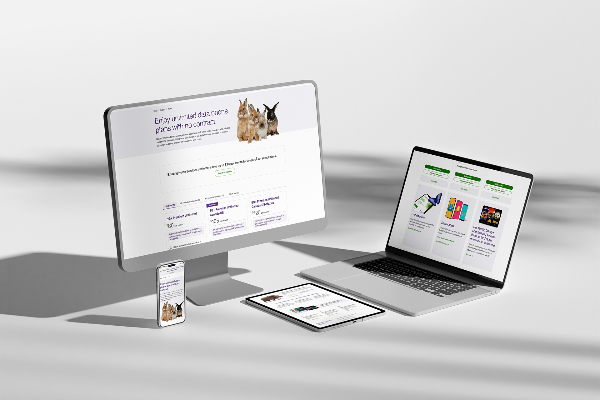

This project aimed at re-designing the TELUS plans page for customers to make the steps to purchasing a plan quick and simple, especially when bringing their own device (BYOD)
The project involved working closely with cross-functional teams to create intuitive and innovative user-centered solution that are both functional and aesthetically pleasing, and visually appealing digital products. Efforts were made to streamlining the BYOD plan purchase process, enhance the overall customer experience, reduce friction, and increase satisfaction.

As the lead designer, my responsibilities included:
- Collaborating with the marketing team to understand business requirements.
- Conducting user research to identify pain points.
- Creating wireframes, mockups, and high-fidelity prototypes.
- Designing user interfaces focused on intuitive navigation and user experience. - Focusing on user-centric design principles to deliver a seamless and satisfying experience for TELUS customers.
- Facilitating workshops with cross-functional stakeholders to ensure alignment with project objectives
Tools used: Figma, Miro, Google Meets, Google Docs
Design System: TELUS Universal Design System
Design System: TELUS Universal Design System

Discovery

Redesign the TELUS plans purchase flow to minimize steps and create a detailed plan for implementing the simplified process, including timeline, milestones, and resource allocation.
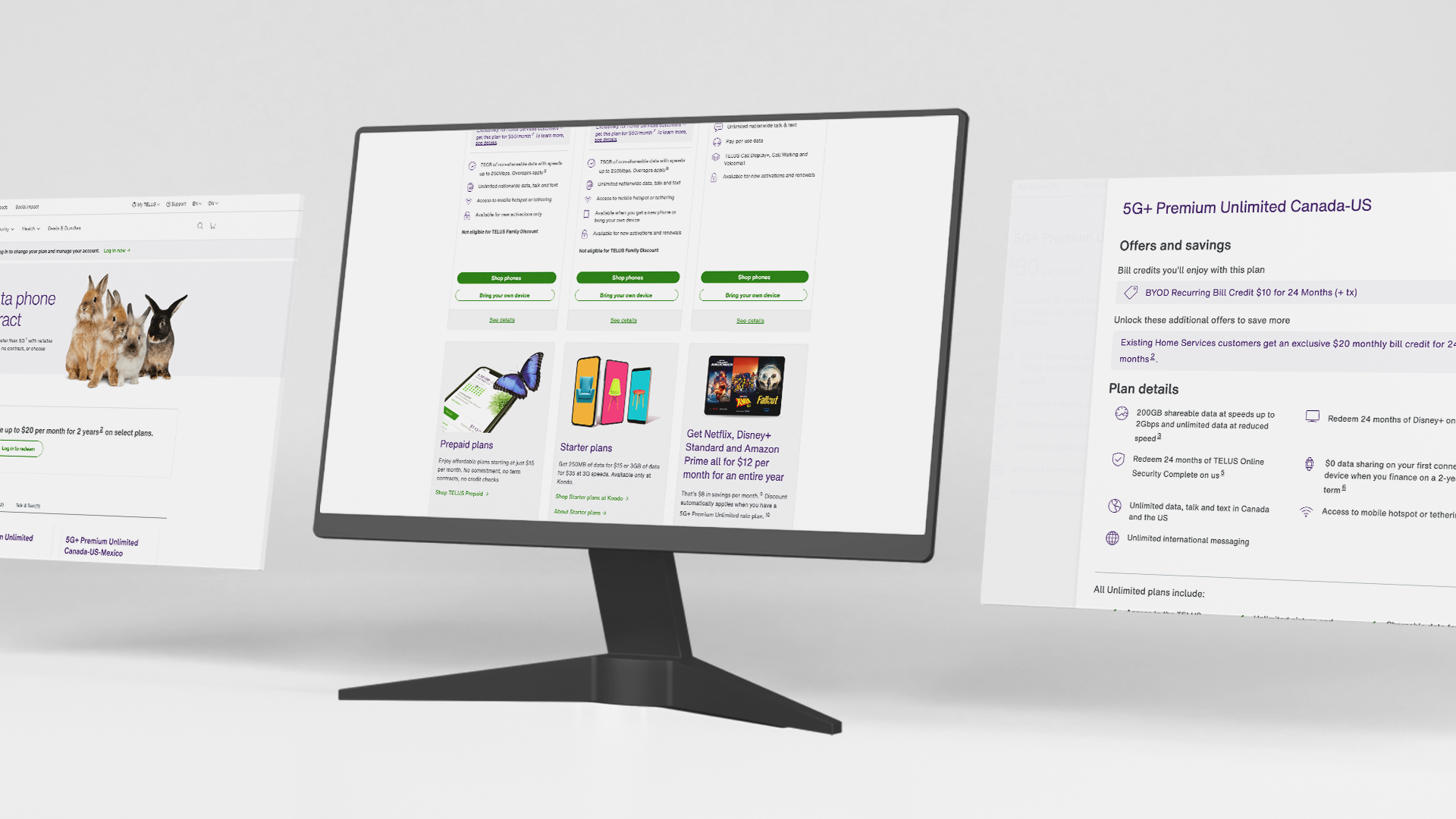
The primary challenge for this project was to redesign the plans page by implementing a clear and intuitive flow that guides users seamlessly through the process. This includes real-time updates to pricing details to prevent discrepancies and incorporating clear and concise instructions and visuals to help customers make informed decisions

After collaborating with various stakeholders from the TELUS team to understand KPI’s and user demographics, I conducted a deep dive into the plan purchase flow to better understand the shortcomings of the current design and address the various customer pain point derived after user interviews and competitive analysis
Preference for Simplicity
The customer preferred to keep the purchase flow simple and relevant
Lengthy Customer Journey
The current process involves a long customer journey with 7+ steps just in the Configure stage, and 19+ steps end-to-end (E2E)
Inconsistent Pricing Information
There is inconsistent pricing information across the purchasing experience, causing confusion and frustration for customers

The project aimed to achieve the following objectives for the success of the project to meet the customer and the business requirements
- Simplify and streamline the plan purchasing process for BYOD customers.
- Reduce the number of steps required to complete the purchase.
- Ensure consistent and accurate pricing information throughout the customer journey.
The above objectives will also be used as the Key Metrics to measure the success the of the project


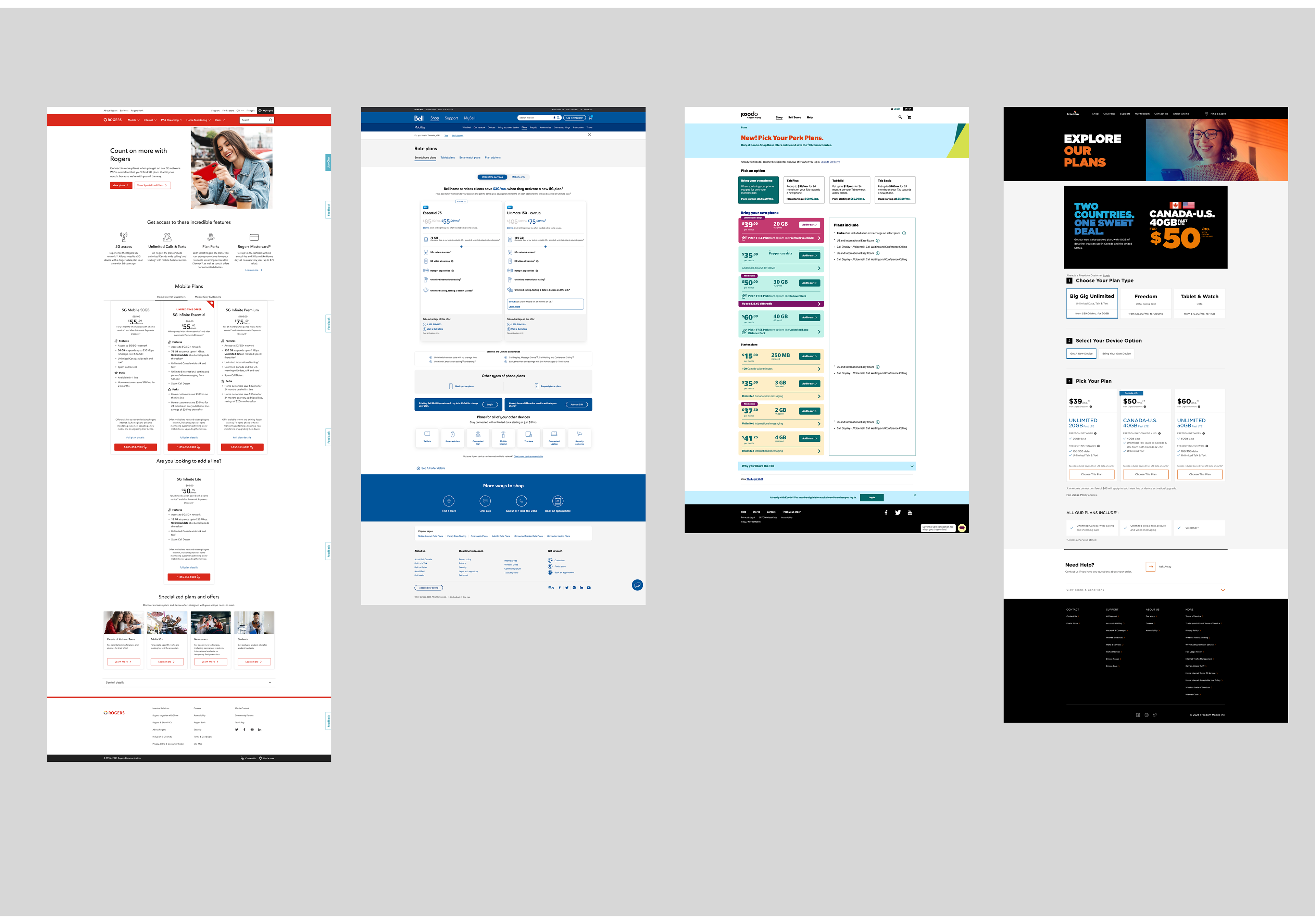
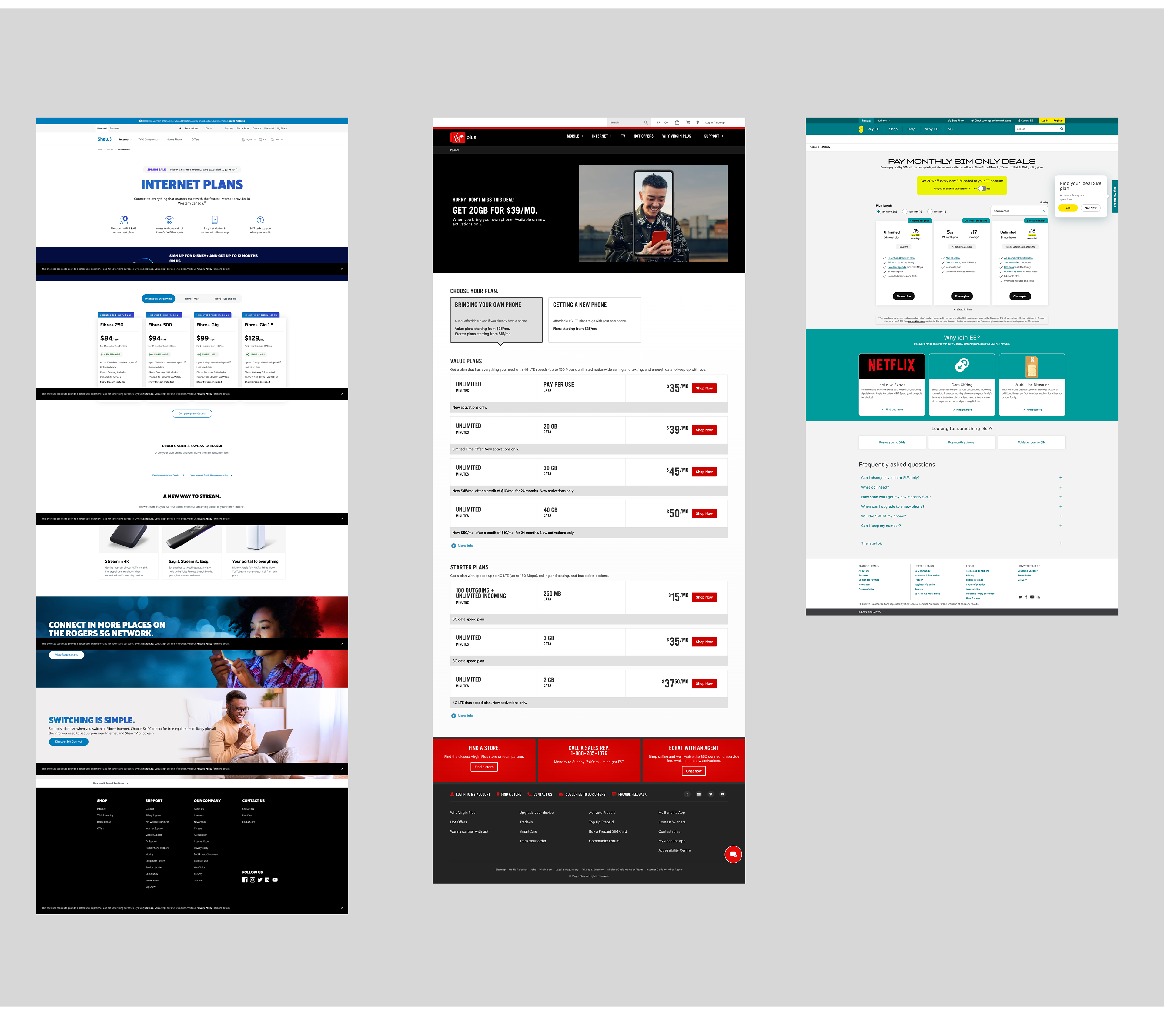
A competitive analysis was conducted to understand how other sites manage their plan cards and purchase flows. This process revealed common UX patterns across various industries and provided a foundation for designing the experience

The next step was to create wireframes to strategically integrate a solution that would communicate clear pricing and details about the plans to the customers. During the wireframing phase, various options were explored. The designs drew inspiration from contemporary trends observed in competitors and incorporated established TELUS components.

Prototypes were created of the new experience based on the wireframes. These were created using feedback from various stakeholders and colleagues, and later put to the test by real usability testers. Prototypes were animated and linked using Figma, as per usual.


The prototypes was put through multiple rounds of user testing during the design process. It was crucial that the new interface was tested with real people. The feedback on content and design provided insights into the users needs and requirement
Testing Environment: Remote, shared screen through Google Meet, recording of the session, with audio
Participants: Mix of Telus and Non-Telus customers, mix of age ranges, income, industries (excl. telecom)


As evidenced by the showcased designs below, user feedback was carefully considered to incorporate essential iterations. As you can see below, the final designs included the updated designs of the plans cards created using the TELUS design system.

Figma pages were created to document the new layout changes for devs. These documentation pages included the positioning of components, exact pixel spacing specifications, annotations about functionality, tabbing order, and other accessibility annotations
Content Governance
Collaborated with the content team to create a content governance document which would act like a single truth of source to share it with the marketing and the development team as a reference point.

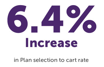
Improved User Experience
The new interface is an improved digital journey for users who wish to purchase any kind of devices or accessories This new design has had very little Voice of the
Customer (VOC) complaints and has been working as intended to provide an interactive experience for TELUS customers.
Collaboration at TELUS
Designing the experience unlocked new ways of working between creatives in the company. I had the opportunity to collaborate with designers, content strategists, and product owners from various teams, to ensure the end-to-end flow of this new journey was seamless.
The relationships developed along the way were vital to the growth of collaboration in the organization and promoted a less siloed approach to design at TELUS.